Introducing Slidewise 1.5
Thanks for bearing with us while we have chipped away at this latest release. It has been almost 4 months since we last updated Slidewise! A long time without a release, but once you try the new version I hope you’ll agree it was worth the wait 😊
The UI
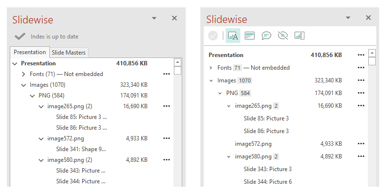
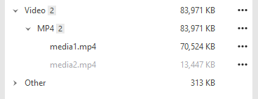
First up - the UI has had a fairly large visual refresh and reorganization to make it cleaner and simpler to use. We have removed unnecessary nodes and excess text from the tree to make it less complicated and easier to navigate.
Comparison between Slidewise 1.4 (left) and Slidewise 1.5 (right).
Slidewise will no longer automatically ‘follow’ when you click on shapes on slide, as this was quickly exploding the Slidewise tree, making it harder to navigate. The inspector tracks what you click on, and there is a new Show in Slidewise button that you can use to explicitly open up the tree and show the media item when you want to.
Notes/Metadata
This new tab currently shows any comments and speaker notes in the presentation.
Comments: export a report of comments to allow for easy referencing of feedback. Navigate between comments and when you are finished - delete all comments from the ellipsis menu.
Speaker Notes: see quickly when a file has speaker notes, so you can easily review them and/or delete them before sharing the file, and avoid accidentally sharing anything you don’t want to.
Hidden content
In this tab you will find items that are hard to spot, because they are invisible or empty. This currently supports hidden slides and empty placeholders, but there will be more types coming soon, including empty text boxes, off-slide shapes etc.
Hidden slides: makes it easy to unhide or remove all of the hidden slides in a presentation at once.
Empty placeholders: quickly identify unused placeholders remaining in your presentation when you finalise it.
Image Audit
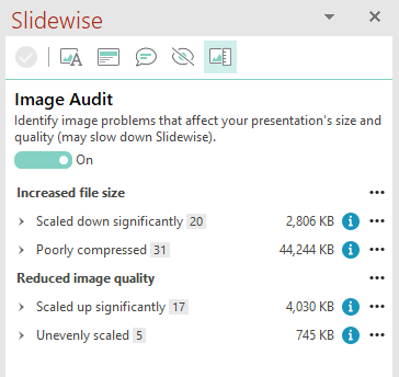
The new image audit scans your file, identifying images that could be problematic due to size or quality issues.
This new scan can take some time to complete, so we have made it optional, and off by default.
Images are sorted into 4 groups:
Scaled down significantly: These images are higher resolution than needed, which increases the size of your presentation. They are being scaled down significantly when displayed at 1080p. Consider compressing them to reduce file size.
Poorly compressed: These images are saved using very high quality, or in an inefficient format e.g. a photograph saved as a PNG. Consider replacing these with more highly compressed versions, or changing their format to reduce file size.
Scaled up significantly: These images have been scaled up significantly to display at 1080p. Depending on the image, they may appear blurry, grainy or otherwise visually poor. Check and replace if needed.
Unevenly scaled: These images have been scaled more in one direction than the other, creating distorted images. Check to make sure that you are not reducing the quality of your presentation.
From here you can jump to the affected images to edit them in PowerPoint, or you can use the Export/Replace image functions to edit them using Slidewise.
Export media
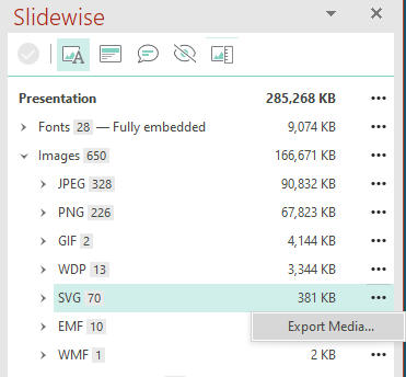
We’ve added an export function at all levels of the tree. You can now export all the media in a presentation, all media of a particular type e.g. all videos, all subtypes e.g. all SVGs, and also individual media objects too.
Image dimensions
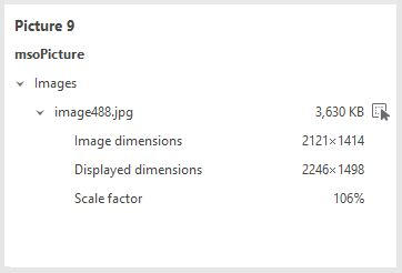
Slidewise now shows pixel dimensions for any PNG, JPG or GIF files in the Inspector. It also indicates the effective display dimensions based on 1080p, along with scale factor, so you can see if an image is being scaled up or down excessively.
Fonts
The Inspector now also shows how each font in a shape is specified to be used: Latin script (latin), Complex scripts (cs), Asian scripts (ea), Bullets (bu), Symbols (sym).
Fonts can be tricky to unpick, however, this should make it a little easier to see when a font is being used for bullets for example, which is hard to spot using the PowerPoint UI.
It’s not a complete solution, but it is a step on the journey. We will be bringing some big font improvements into our next release, so keep watching.
Hidden shapes
In the previous version it wasn’t possible to see if a shape was visible or not. If you double-clicked on it, it would jump you to the slide but as it’s not possible to select a hidden shape it would give you no indication of where the shape in question was.
Now hidden shapes are marked in grey rather than black and if you double-click them as well as jumping to the slide it opens the selection pane so you can see the hidden shape and if you want, make it visible.
Slidewise report
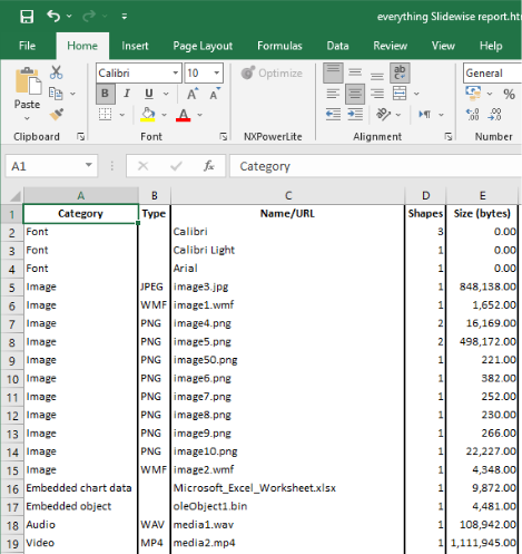
This report gives you a detailed overview of the media and sizes in the file - you can export it from the media and fonts pane, under the Presentation node. Handy if you need to share the information that Slidewise shows for a presentation with someone who doesn’t have Slidewise.
The report outputs to a structured HTML file for easy viewing in a browser like Google Chrome, or you can open the html file in Excel, where the results will be formatted neatly into cells (see below).
On the Ribbon
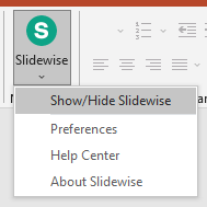
We have extended the Slidewise button on the Home tab. For those who use it from here, you can now access all of the functions from the dropdown split button, without having to go to the Slidewise tab.
And another thing… or three
We fixed an unfortunate bug with the Replace Image feature - previously if you replaced an image with a smaller image the size of the presentation file wasn’t being reduced. That clearly didn’t help, so sorry about that. It’s fixed now.
We also fixed two more issues preventing OneDrive files being found - the saga continues…
Finally, we wanted to make sure that everyone could try this new version, so we have reset the trial period. So even if you have had a 14-day trial before, you can get another 14 days with version 1.5.

