What’s new in Slidewise 2?
8 Min Read
We’re really excited to announce the arrival of Slidewise 2! This major upgrade includes new features to manage the colors in your presentations, find cropped images and reassign slide layouts more easily. We have also dramatically improved reliability and reduced UI friction, making Slidewise feel more effortless to use.
Before we dive in, you can download a free trial for Slidewise here.
Let’s start with the addition of the Color feature, which will make managing colors in your presentations much easier – read on to find out how it works.
Colors feature
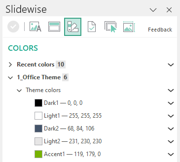
Slidewise searches through and builds a list of every color used anywhere in your presentation. It organizes and displays this information in its familiar treelist for easy navigation.
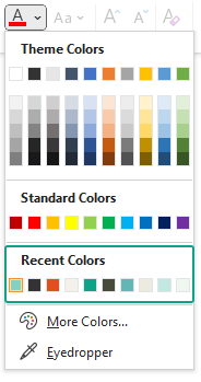
You will see Recent colors first - these are non-theme colors that have been used while working on the presentation. If you are creating a template then you will probably want to remove these before sharing the file, so that subsequent users don’t end up using colors that aren’t part of your theme. They are ever so enticing when they appear in the list of color choices for users.
Slidewise makes removing these easy - with a Clear Recent Colors tool.
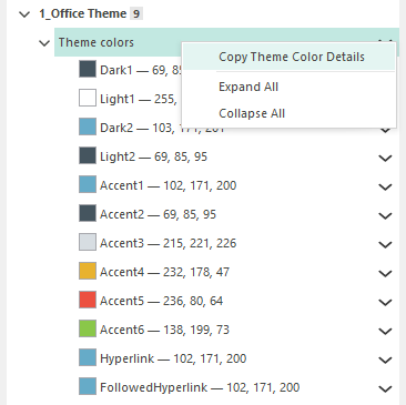
Colors are all grouped under their corresponding Master, so if you expand a master you will immediately see its theme colors. Right-click or use the menu and you can copy all of the color references to the clipboard to paste into another application.
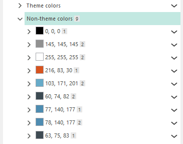
Any non-theme colors will be listed below the theme. These are all the places where a color has been directly set, rather than using one of the theme colors. The consequence of doing this is that if you change the theme later, or copy and paste slides into another deck, the colors will not adapt so will stay exactly the same. For example, if you have a rebrand and a blue is changed to green, if you are using the theme everywhere you can update the color in one place and it will change throughout the presentation.
Double-click any shape under the colors to jump to it in PowerPoint, so you can check if it should be set to use the theme colors or not.
PowerPoint allows up to 50 custom colors to also be configured for each master, and if any exist, Slidewise will display all the places those custom colors are used.
Aside: if you want to learn how to set up your own custom colors you should take a look at this article from BrightCarbon that walks you through the whole process.
To copy out any individual color reference you need, simply right-click or use the menu alongside the color and choose if you want the RGB or Hex color reference.
Slidewise defaults to showing colors in RGB but it’s simple to switch this view using the menu option under the Ribbon button on the Home tab, or by using the checkbox on the Slidewise tab.
Next up, there’s been a big change to the existing tool previously known as Transitions. It is now called Slide Selection and we think it might just be the start of something really useful.
Organize slides with slide selection
By default, this pane will show the same transition information you might be used to, and you can still use it to manage transitions as you did in the previous version.
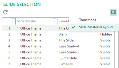
Now though, it also gives you an even easier way to reassign slides between layouts using a little of Slidewise and a little of PowerPoint. Click on the Columns button and choose Slide Masters/Layouts.
You will see a list of all the slides in your presentation and their corresponding master and layout. Any slides you select in this list will also be selected in PowerPoint.
TIP: To select multiple slides: hold down the "Ctrl" key and click any slides in the list, or for adjacent slides you can click the first slide, hold the “Shift” key down and click the last slide you want to select. You can then release the “Shift” key.
Use the Sort or Filter options to quickly narrow down to just the slides you want based on the master or layout they are using. Then you can move over to PowerPoint where those slides will be selected, right-click on one (or click the Layout button on the Ribbon if you are in Slide Sorter view) and you can use the native Layout option, to change the layout for those slides.
It makes the job of reassigning slides between layouts so much easier and makes the most of the sorting and filtering options in Slidewise, combined with the visual menu option in PowerPoint.
Watch how quick and easy it makes this normally painful task. You can naturally still use the automatic consolidate feature in Slidewise - but for those people who need to reassign slides bit by bit this is a game-changer!
Find cropped images with Image Audit
Cropped images can contain extra data that increases the size of your presentation, but they can also potentially contain hidden but sensitive content that you don’t want to distribute with the file.
Now the Image Audit will scan for and identify any images that have been cropped, to allow you to quickly pass through and check them. We’ve also changed the behaviour, so when you double-click on an image to jump to it in PowerPoint, Slidewise automatically switches you to the appropriate Picture or Graphic format tab on the ribbon, so the crop button is close to hand.
Images that are cropped are also now indicated in the Inspector.
New File Review tab
We’ve combined the existing Notes and Metadata and Hidden Content tabs into the new File Review tab. This tool is aimed at showing you all the hard-to-spot things that you might want to avoid sharing with your file.
We’ll be adding more information to this scan soon.
Replace font improvements
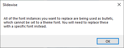
Bullets cannot be set to use the Theme font in PowerPoint. So if you attempted to replace a font that was partially, or entirely used for bullets then Slidewise would just silently fail, leaving the font still in the list when the file opens up again.
Now, Slidewise warns you if you are trying to do this, before closing your file, allowing you to adjust accordingly.
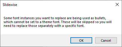
If only some of the font instances are used in bullets, you have the option to either continue on and replace the non-bullet fonts, and replace the bullets afterwards, or cancel and change to choose a specific font to replace all the instances with.
New information alerts
We’ve added a second level of warning to use when we just want to provide greater insight to the content in your file and links to further reading. These will appear alongside certain nodes, and when you roll over the information icon a tooltip will show the additional information.
Ease of use improvements
Not content with just adding features, we’ve spent a lot of time fixing glitches, tweaking workflows and streamlining the user interface to make using Slidewise feel more effortless. In no particular order, here are the main changes:
The tab buttons are larger, making them easier to distinguish between and also easier to sweep your mouse onto and click.
We’ve added all of the functionality to the right-click menus, so now you can right-click on items in the tree and edit them without having to throw your mouse over to the menu button.
We’ve extended the menus to the Inspector - so now you no longer have to find an item in the Slidewise index before you can work with it.
We’ve tweaked the behaviour to automatically expand the tree when it makes sense to do so, reducing the number of clicks needed to get to the content you want.
Now when you jump to a picture or graphic from Slidewise it will automatically switch you to the Picture format/Graphics format tab, so you have the relevant tools to hand.
Finally, we’ve changed Slidewise so it can now be registered per machine rather than per user — to make it easier for bulk deployment or running in Terminal Server/Remote Desktop environments.
Acknowledgements
Making quality software is a bit harder than it looks, and it’s not just our blood, sweat and tears going into it. Slidewise only continues to improve thanks to the invaluable contributions of a number of thoughtful, supportive people, without whom Slidewise 2 wouldn’t have been possible.
Our thanks to Lars Chrois from Prsnt in Denmark who continues to regularly provide insight on the ideas we share, feedback on the features we make, and a deep technical understanding of how PowerPoint works that we are happy to lean on. Also for his invaluable help improving our getting started guide this time around.
Nolan Haims from Nolan Haims Creative always takes the time to try out any new features we share and thinks hard, to provide thoughtful and useful feedback every time. Thanks also for the suggestion of adding a thin grey border on the color swatches, to stop the white swatches disappearing. That turned out to be surprisingly tricky, and we ended up having to overlay a transparent SVG, with a grey border over a background color to get the effect. Nolan also deserves thanks for creating the awesome Better Deck Deck, which we used to guide our initial efforts at a getting started guide presentation.
Thank you Troy Chollar from TLC Creative Services, Inc. for suggesting we identify duplicate colors, and sharing detailed insight to how his team would use the ability to copy out Theme color breakdowns for producing brand guides. Also for requesting we extend the Image Audit to show cropped images - that has turned out pretty nicely! We haven’t yet implemented the duplicate warnings but we recognise it will be great, so it will be coming soon.
Thank you Steve Rowland from Sharpn in the UK for his extensive and insightful feedback on our basic color feature. We haven’t had time to do half of what he suggested yet sadly, but Steve, rest assured the ideas are excellent and firmly in our future plans.
Leela Williams from Yellow Balloon here in the UK always provides helpful insight into how features in Slidewise map onto the work that needs to be done, which is so helpful to understanding if what we design is actually going to help.
Mike Parkinson from Billion Dollar Graphics for his inimitable enthusiasm that keeps us energized about the work we are doing. Also for having the fastest response time ever to a request for feedback: 12 minutes! He must have literally dropped everything to install the development build we sent him, try it and then answer our questions.
Finally, a very special thanks this time to Jamie Garroch from BrightCarbon, for helping us to hack our way around a tricky hole in the PowerPoint object model that had been bugging us for a long time.
“We want to give regular PowerPoint users access to professional time-saving tools that are both lightweight and flexible. Slidewise empowers users by helping them to quickly identify issues and inconsistencies, and easily solve their own PowerPoint problems without wasting time asking colleagues, forums or IT support.”
Coming up next, we will certainly be continuing to work on the Colors feature, adding warnings and a replace color capability. Beyond that we have a very long list of potential improvements and additions - so we will be contacting Slidewise customers soon to vote on what from our list is most important.
You can learn more and download the software from the Slidewise product page. We have reset the trial period, so even if you have tried it before, you can try version 2 free for another 30 days.

